About
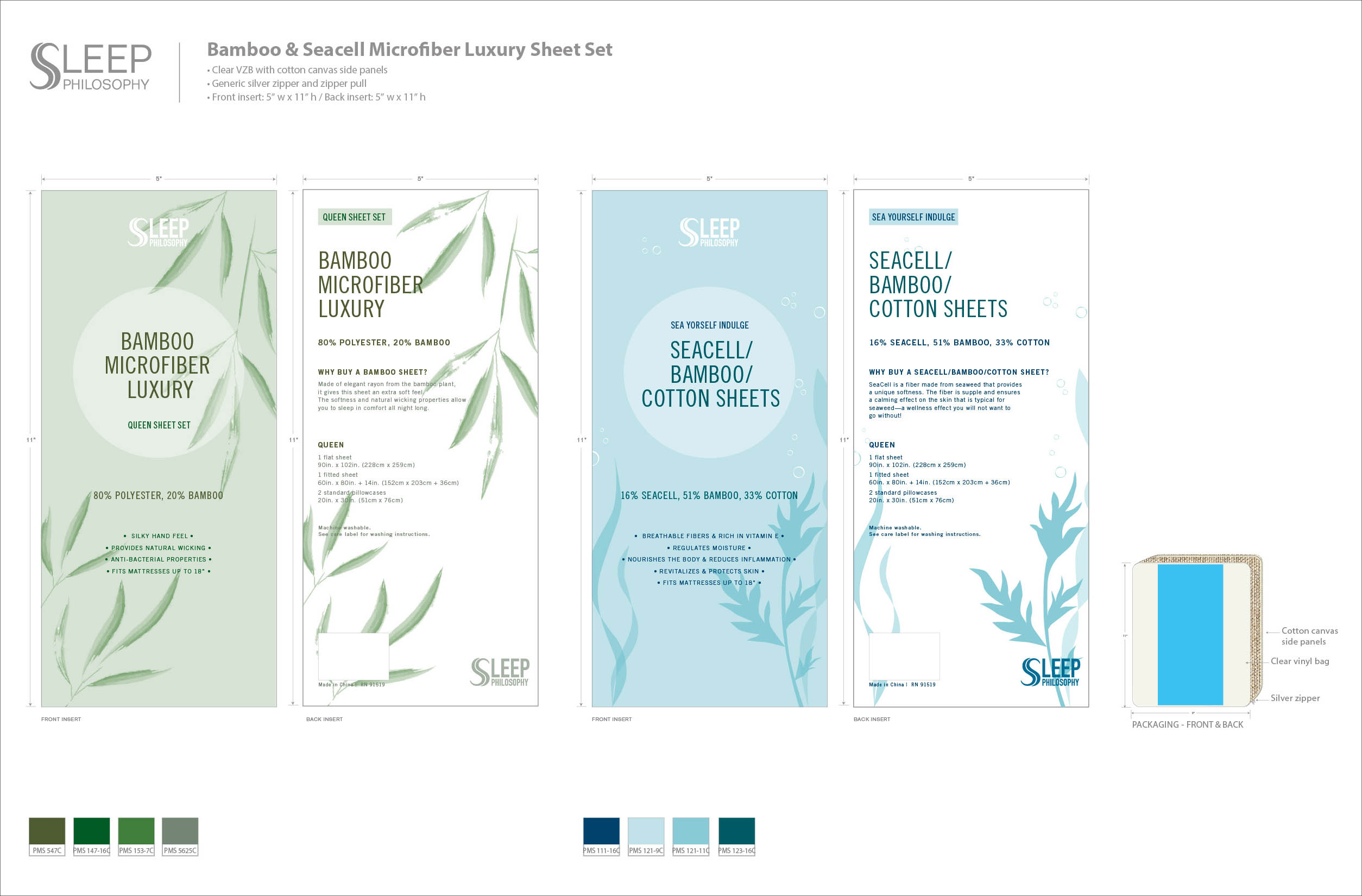
Among the hundreds of products displayed on the shelf, which ones stand out? For the Fall 2017 New York market, Sleep Philosophy Sheet sets wanted to freshen up a brand new look to attract the eyes of busy buyers. With modern and clean design in mind, I decided to go with a graphics only look to highlight the key features of these products.
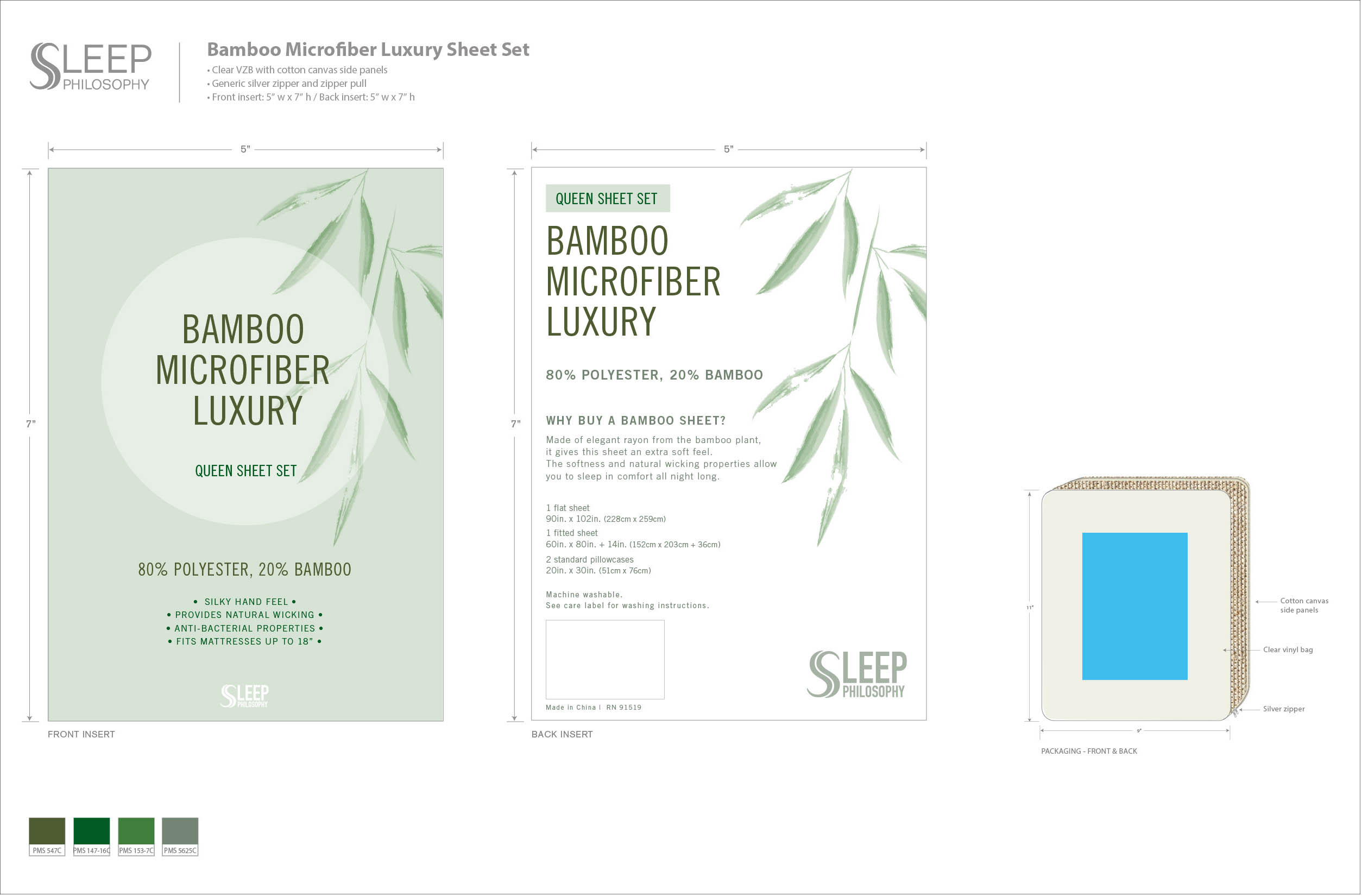
First draft was a more traditional approach in terms of insert position on the packaging, showing more product through the clear VZB. I’ve decided to use canvas side panels to coordinate with the more natural martials used to product these sheet set.

On a second look, however, the information seem too crowded for the back insert, so for the final design inserts sizes are increased in length to give more clean and relaxed look.

This project was done for E&E Co., Ltd. All rights reserved.
